
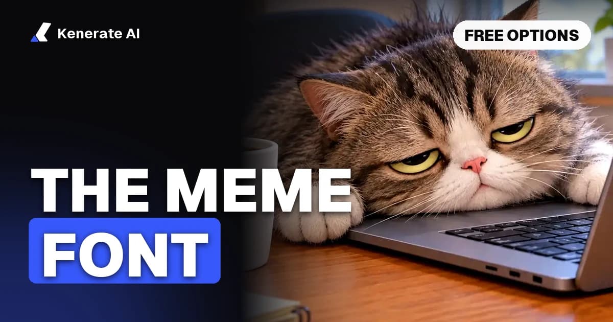
Classic memes use Impact: a heavy, condensed sans-serif set in white capitals with a black outline. Newer formats have moved on to fonts like Arial, Comic Sans and Montserrat, but Impact is still what most people mean by "the meme font". If you can't use Impact, Anton is a free look-alike on Google Fonts.
That is the short answer as of 5 November 2026. The rest of this guide covers why Impact won, which font fits which format, what the licence lets you do, and how to set the outline so your text stays readable on any picture.
What is the meme font called?
The meme font is called Impact. Geoffrey Lee designed it, and the British foundry Stephenson Blake released it in 1965, according to Microsoft's typography page for Impact. That makes the typeface decades older than the internet jokes it became famous for.
Two things create the look, and only one of them is the font:
- The typeface. Impact has thick strokes, tight spacing and a tall x-height, so a lot of words fit across an image at a large size.
- The styling. White fill, black outline, all capitals, centred, with one line at the top and one at the bottom. Impact doesn't include the outline. It is a stroke added by the editor.
This is why people searching for "meme font" often install Impact and still don't get the right result. Without the outline, white text disappears on bright parts of the picture.
Why do memes use Impact?
Memes use Impact because it was already on almost everyone's computer, and because it reads well on top of photos.
Microsoft included Impact in its Core fonts for the Web, posted on 1 March 1996, and has shipped it with Windows since Windows 98. When early image macros spread, nobody had to download anything to match the style.
Know Your Meme's history of the font traces the earliest known Impact image macro to a 2003 Happy Cat picture, and notes that Impact later carried formats such as Advice Animals around 2009 and 2010. Sources disagree a little on timing, because some date the cat meme's breakout to 2007 rather than its first appearance.
The bigger push came from tools. Know Your Meme lists Cheezburger, Meme Generator, Quickmeme, 9GAG and Imgur among the captioning tools that used Impact with a white fill and black border. Once the style was the default in the tools people used, it became what a meme was expected to look like.
Which font do different meme formats use?
Impact isn't the answer for every format. Kapwing's meme font guide splits fonts by the kind of joke, and How-To Geek puts Arial and Comic Sans as the small minority next to Impact in classic meme pictures.
| Meme style | Font commonly used | What it signals | Free option |
|---|---|---|---|
| Classic top and bottom text | Impact | Instantly reads as a meme | Anton |
| Doge-style captions | Comic Sans MS | Deliberately silly, childlike | Comic Neue |
| Plain caption above a picture | Arial | Neutral, lets the joke do the work | Arimo |
| Modern, clean meme pages | Montserrat | Polished, more brand-safe | Montserrat |
| "Fancy" or mock-elegant jokes | Dancing Script, Satisfy, italic serif | Ironic sophistication | Dancing Script |
| Brat-style lime covers | Arial Narrow (close match) | Lo-fi, deliberately blurry | Archivo Narrow |
Two notes on that table. The original Brat album cover font isn't publicly identified, so Arial Narrow is a look-alike, not a confirmed match. And the free options in the last column are our suggestions for a similar feel, not exact copies.
What font do TikTok memes use?
TikTok has its own typeface, TikTok Sans, which is open source under the SIL Open Font License and listed on Google Fonts. Older guides still name Proxima Nova, so treat those with care. For a meme you're posting on TikTok, the in-app text tools are usually simplest. To match the look outside the app, download TikTok Sans.
Is the Impact font free to use?
Impact is free to use if it came with your copy of Windows, but it isn't open source, and you can't pass the font file around.
Microsoft's font FAQ covers fonts supplied with Windows. In short:
| What you want to do | Windows font rules |
|---|---|
| Make and share a meme image | Allowed. Graphic files made with the fonts can be shared. |
| Sell a poster or t-shirt with the text printed on it | Not restricted, unless your app is licensed for non-commercial use only |
| Burn captions into a video as pixels | Allowed, as long as the font file isn't embedded |
| Send the font file to a friend or re-upload it | Not allowed |
| Self-host it on your website or convert it to WOFF | Not allowed |
| Modify the font | Not allowed |
So the image is fine. The font file is what you can't redistribute. If you're building a website, app or game that renders meme text live, you need a licence or an open font.
This is a plain summary, not legal advice. The FAQ is general and doesn't list Impact by name, so check the current terms for anything commercial. Separately, the licence on the font says nothing about the picture under it. A photo or character you don't own has its own rights.
What are the best free alternatives to Impact?
Anton is the closest free alternative to Impact. All four fonts below are on Google Fonts under the SIL Open Font License (OFL), which allows personal and commercial use, including bundling the font in a project.
| Font | Designer | Licence | How close to Impact | Best for |
|---|---|---|---|---|
| Anton | Vernon Adams | OFL | Closest | Direct replacement for meme text |
| Oswald | Vernon Adams, Kalapi Gajjar, Cyreal | OFL | Lighter, more open | Several weights, longer captions |
| Bebas Neue | Ryoichi Tsunekawa | OFL | Taller, all caps | Clean, poster-like memes |
| Montserrat | Julieta Ulanovsky and others | OFL | Different, wider shape | Modern meme pages |
Designers and licences above come from each font's metadata in the Google Fonts repository, checked on 5 November 2026. "How close" is our own judgement of the letter shapes.
Use Anton if you want the classic look on a website or in an app, since you can self-host it and Impact's Windows rules don't allow that.
How do you add the black outline to meme text?
Add a stroke to white text: black, placed outside the letters, about 3 to 5 pixels wide on a normal-sized photo. How-To Geek's walkthrough uses those numbers, and notes that Imgflip's generator defaults to a 5 px black outline.
In Photoshop
- Type your caption in Impact or Anton, in capitals, centred, with white as the colour.
- Open the layer's Blending Options and tick Stroke.
- Set Size to 3 to 5 px, Position to Outside, Blend Mode to Normal, Opacity to 100% and Color to black.
- Duplicate the layer for the bottom line, so both captions match.
GIMP and Paint.NET can produce the same result. On a very large image, raise the width in proportion, because 5 px looks thin on a 4K picture.
In CSS
For meme text on a web page, browsers support the -webkit-text-stroke property, described in MDN's reference:
css.meme-text { font-family: Anton, Impact, sans-serif; text-transform: uppercase; color: #fff; -webkit-text-stroke: 4px #000; paint-order: stroke fill; }
The stroke is drawn across the edge of each letter, so a thick stroke can eat into the white. paint-order: stroke fill paints the white on top, which keeps the letters full width. Listing Anton first means your page uses a font you're allowed to self-host.
With an AI image model
You can skip the editor. In the AI meme generator, describe the scene, put the exact words in quotes and ask for the font style. For example:
Meme image: a tired cartoon cat slumped over a laptop with a coffee mug, top text 'ME ON MONDAY' and bottom text 'SEND COFFEE', classic white impact-style meme font
The picture and caption come out together. On Kenerate AI, GPT Image 2 costs 18 credits at 1K (medium quality) and spelled every caption correctly in the tests on that page. Qwen Image 3.0 costs 9 credits and handles short text. Keep each line to five words or fewer. Asking for an "impact-style" look gets you lettering in that style, drawn by the model, not the Impact font file.
If the wording needs fixing later, change the text in the image rather than regenerating the whole picture.
How do you make meme text easy to read?
Most unreadable memes fail on layout, not font choice. These habits help in any editor:
- Keep lines short. Five words or fewer per line stays large enough to read in a phone feed.
- Use capitals with Impact. The style depends on them, and lowercase Impact looks out of place.
- Keep text off the subject. Leave the face or the action clear, and put captions at the top and bottom edges.
- Centre the text. Left-aligned text looks like a caption, not a classic meme.
- Check it at thumbnail size. If you can't read it small, cut words or make the text bigger.
- Use your own pictures. Original scenes and cartoon animals keep you clear of photos you don't own, and of people who never agreed to be a meme.
The same rules carry over to moving formats. You can add captions to a video in a bold style, or turn the joke into a clip with the AI meme video generator. For the lime green look, use the Brat generator.
Which meme font should you choose?
Pick by what you're making:
- A classic meme on your computer: Impact, white with a black outline.
- A website, app or game that renders text: Anton, because you can self-host it under the OFL.
- A brand or business post: Montserrat or Bebas Neue, which look cleaner.
- A joke that is meant to look bad: Comic Sans.
- No editor at all: describe the meme and let the AI meme generator draw the caption into the picture.
Impact has lasted because it solves one problem well: big, readable words on any picture. Add the outline, keep the lines short, and any of these fonts will do the job.