

Why text used to fail — and what changed
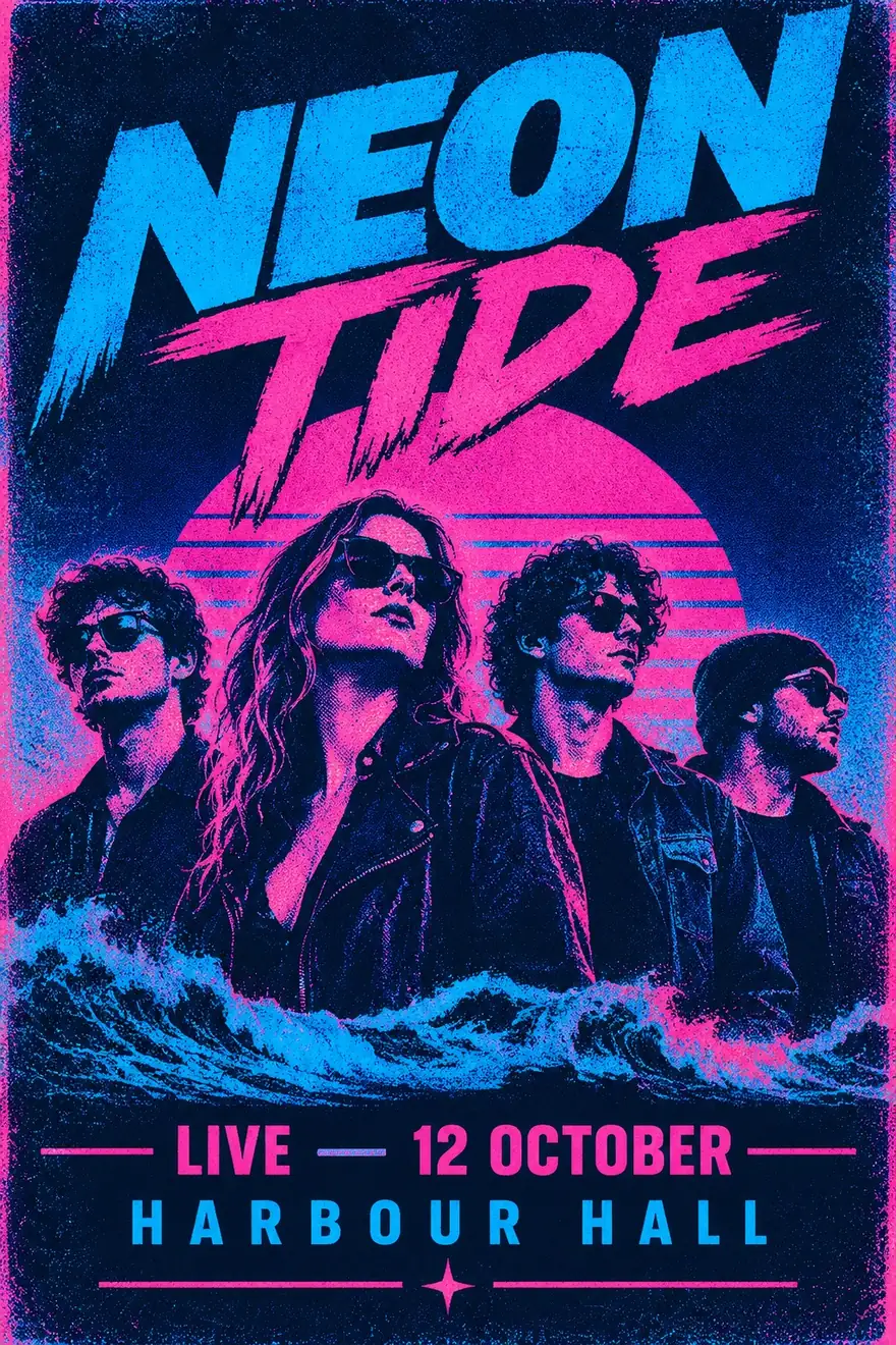
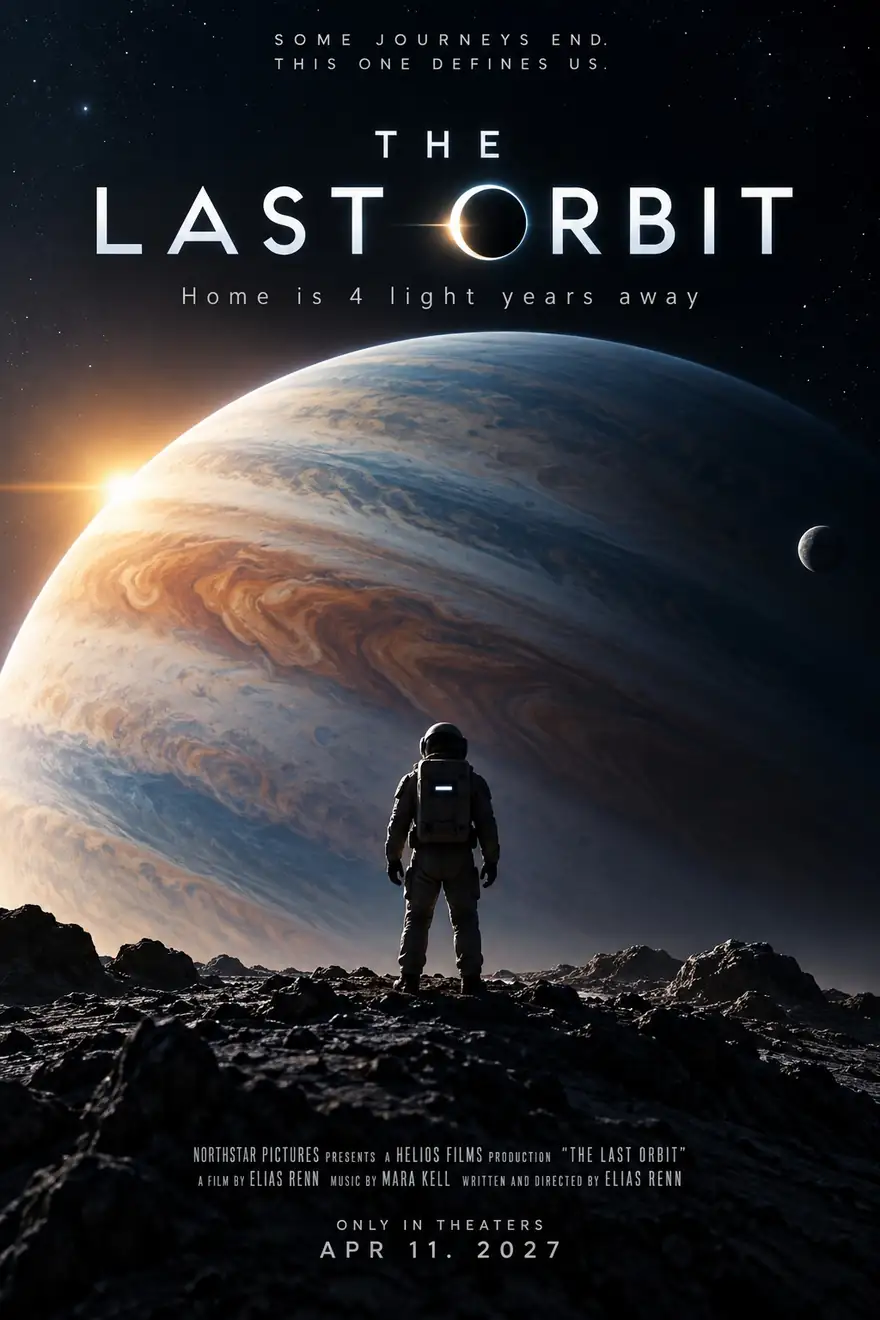
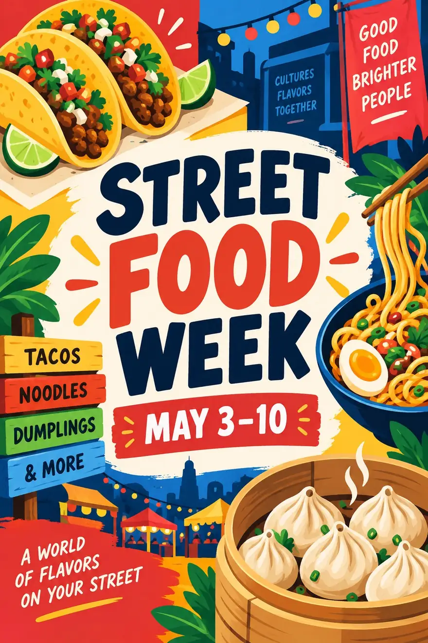
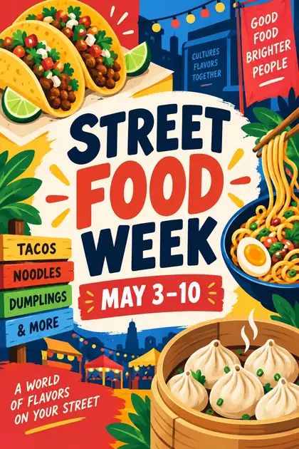
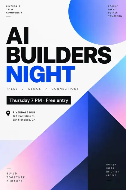
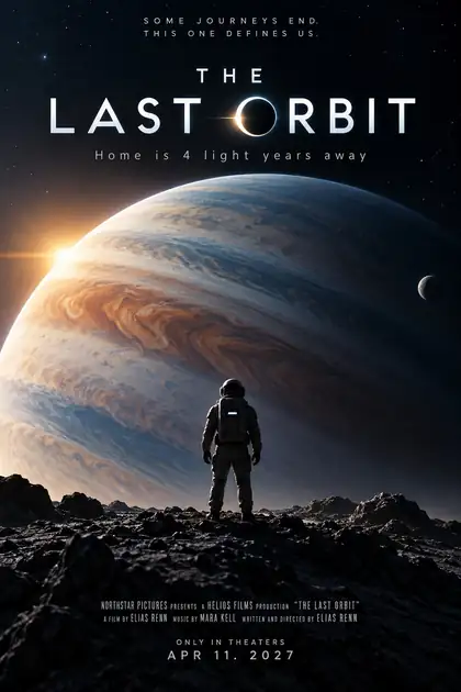
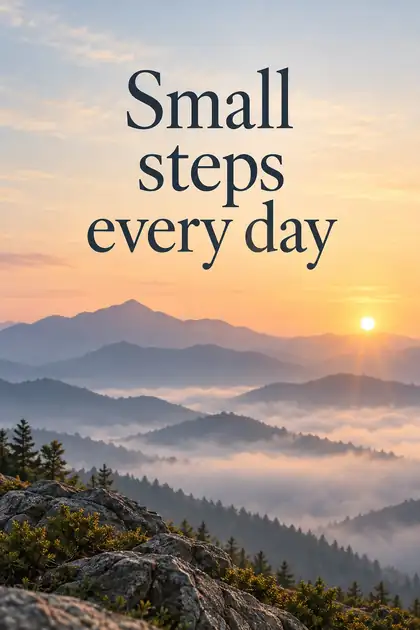
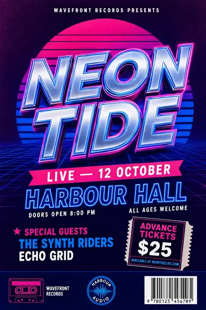
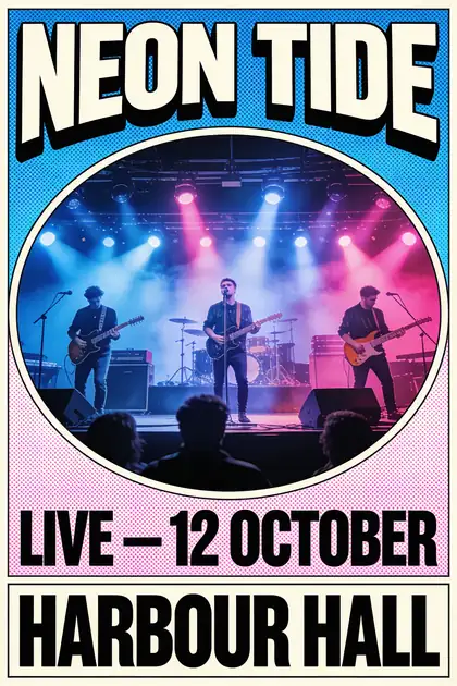
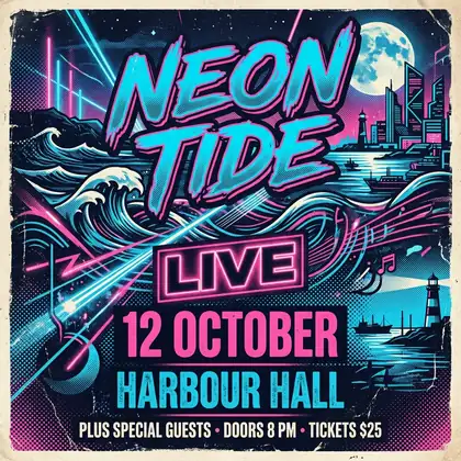
Older image models drew letters as shapes, so posters came out with gibberish. Recent models such as GPT Image 2, Qwen Image 3.0 and Seedream 4.5 were trained for text rendering and now spell short titles correctly most of the time — all four models in our comparison got 'NEON TIDE' right.
Designing for print
A few things matter once a poster leaves the screen:
- Size: 2:3 at 4K is roughly A-series proportions at good print resolution.
- Margins: ask for a clean border so nothing gets trimmed.
- Contrast: dark text on light, or light on dark, reads across a room.
- Proofread: check dates and names letter by letter.